Whether you are getting ready to design your site for the first time, or planning a major site redesign, here are three important things to remember as you start designing your website:
No. 1: Know your audience
Spend some time thinking about who your target audience is – are you reaching out to a professional audience of photo editors, art buyers, and art directors? Or do you typically seek out customers who need portraits and event photography?
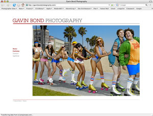
Gavin Bond’s website uses the Left-hand version.
In developing clickbooq, we knew photographers provide services to two very distinct audience types – creative professionals (businesses) and consumers. Art directors and photo editors most likely have large monitors, which was why we developed the top down version for larger screens. The consumer audience may have smaller monitors or be on laptops, which is better suited for the left-hand version. Research your audience and tailor your site to fit their needs.
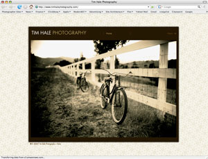
Tim Hale’s website uses the Top-Down version.
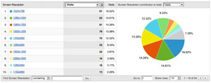
An easy way to see what screen resolution you should optimize your website for is to check your Google Analytics stats*. Login to your Google Analytics account and select Visitors > Browser Capabilities > Screen Resolutions from the left-hand menu.
Check what screen size the majority of your visitors are using. If a high percentage of your visitors have a screen resolution of 1024×768, we recommend the left-hand version which was designed to fit on their computer screens with no scrolling.
View your visitor’s screen resolutions using Google Analytics. 
*If you haven’t added Google Analytics tracking code to your site yet, you can get step-by-step instructions in our KnowledgeBase article.
No. 2: Keep a consistent “trademark” style
Every photographer should have his or her own distinct visual style. It’s important for the tone of your website to complement this personal aesthetic rather than compete with it. If your photographs are fun and playful, your website should reflect that as well. Browsing through your site should give clients a good indication of what they can expect when they hire you for the job. This helps attract the “right” clients for your talent.
No. 3: Be choosy when selecting images to show on your website
Obviously image selection is critical, just as it is for a traditional printed portfolio. Not everyone has time to look at every single image on your website so pick images that best represent your work. Show depth and breadth in your portfolios without diluting a strong showing of your strengths and specialties. Remember, your potential clients can always request more images from you. With clickbooq, you can follow up with a private online gallery containing a selection of images tailored to the client’s prospective job.
