“It’s a new dawn. It’s a new day. It’s a new life. For me. And I’m feeling good.” – Nina Simone
Today we are announcing the public launch of clickbooq v3! We are calling it “v3” to differentiate it from the previous system, but don’t be fooled by the name. This not simply a new “version” of clickbooq. This is an entirely new application, built from the ground up, to be THE website builder of choice for creative professionals. We’re not talking about a static website template with a chevron-patterned background. Or a one-size-fits-all approach for everyone from brides to restaurant owners to your dentist. Our system is designed for creative professionals who want to showcase their best work in a visually stunning format.
This is a revolutionary new service that packages beautiful sites with a simple yet powerful website application. clickbooq’s new Toolbox application makes it easy to create a custom-built website AND update your site or share new client galleries, quickly and intuitively. Before you sign up for any run-of-the-mill website builder, make sure you take a look under the hood to see what’s powering your site. Other builders only provide basic management tools and features in their applications, making common tasks such as organizing portfolios or uploading images a cumbersome experience.
Many also don’t provide a way to store all of your uploaded images in a single, searchable archive. Searching through folders on your hard drive for images every time you create or update your portfolio is a tremendous waste of time. With a clickbooq Pro account, you can store up to 5,000 images and all of them are accessible in your All Images folder.

Here are just a few of the new features we’ve added:
- No Flash: Both the Toolbox web application and clickbooq websites have been rebuilt using HTML5 and Javascript. This means no more “HTML companion sites” – the site you see on your desktop is the same site that loads on your iPhone – it’s just been optimized to display on a smaller screen and are touch-enabled. This ensures your site is accessible from any device and displays consistently the way your want.
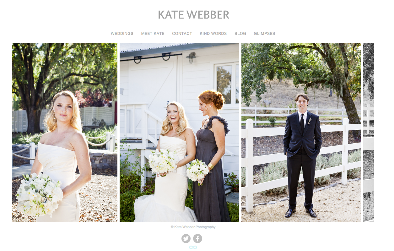
- Responsive sites with larger images: Images scale up or down based on browser size and device and allow for a more fluid layout of your images and content. You can even display your galleries to fill your site edge-to-edge and your navigation menu on top of the image for maximum impact.

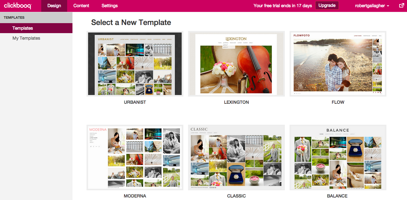
- New Design templates: Easily lay the framework for a beautiful site design with our new templates. Greater design flexibility lets you choose from even more style options and customizations.

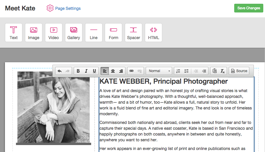
- Flexible page designs: Add a mix of images, text, links, and HTML to your pages. Embed a YouTube video or a Google map. A text editor makes it easy to insert text where you want.

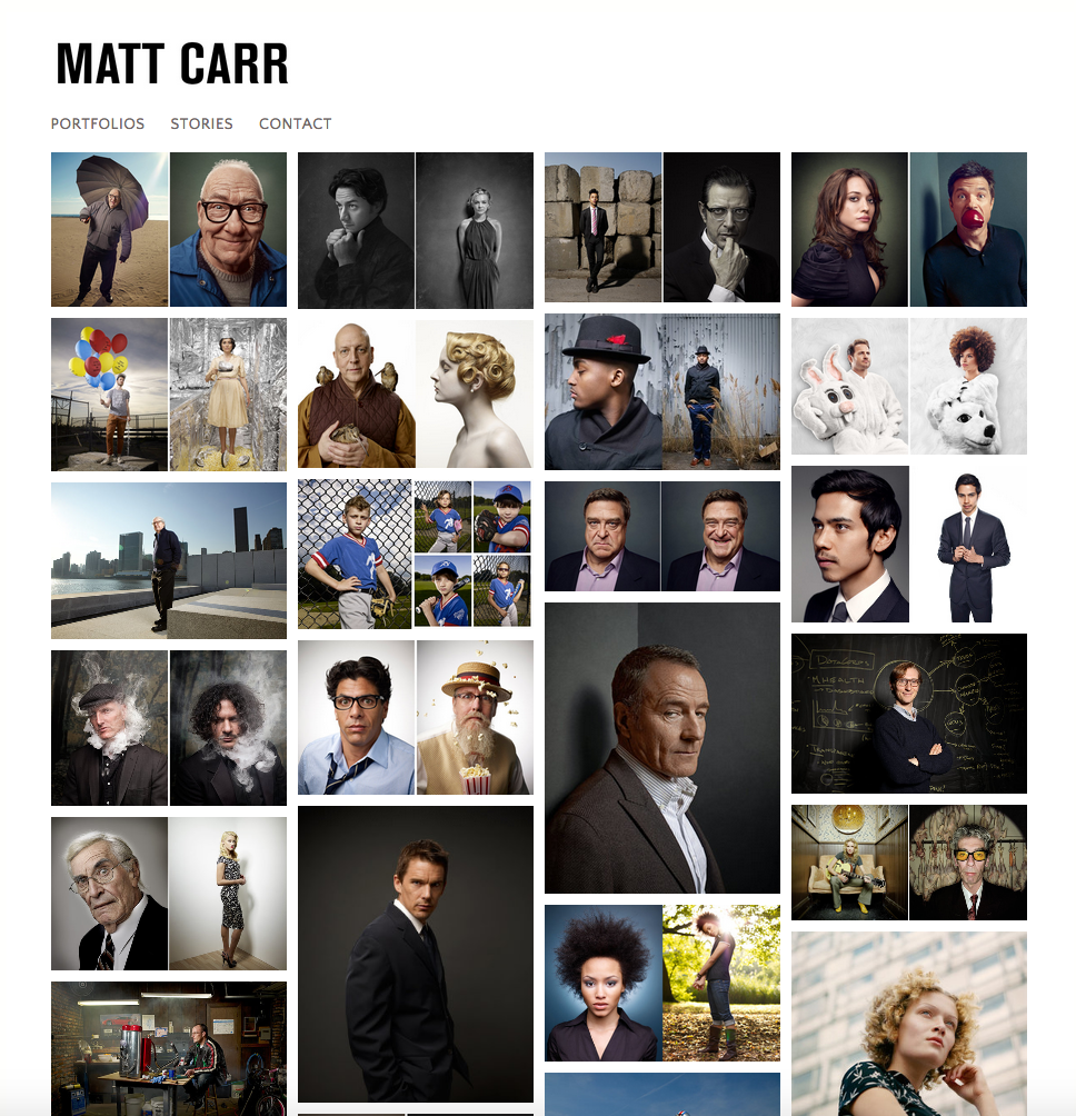
- New Gallery options: In addition to our tried-and-true Slideshow format, we’ve also introduced a Grid style to create a Pinterest-like gallery, Horizontal Scroller galleries, and Vertical Scroller galleries. You can also create Index Grid Pages – a visual index of thumbnails that can link to galleries, pages, or external links.

- Greater visibility: Link directly to galleries and pages with search engine friendly URLs, more and better integrations with your social networks
For more information and to test-drive actual user sites and templates, please visit http://www.clickbooq.com. If you’re not using clickbooq yet, sign up for a free 14 day trial.
