Creating your site’s design often revolves around the color palette you choose. Your background color, borders, inactive and active font color, logo, and images are all part of your site’s palette. Do you prefer a monochromatic look – all white or different shades of grey? Or do you want to emphasize the playfulness of your images with vivid, highly saturated colors? Fortunately for you, your choices don’t have to be permanent so you can switch it up whenever you want.
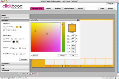
We give you two color pickers – 216 web-safe colors plus the advanced color picker that allows you to further adjust your selection. You can select a color in the color field, use the color slider, or enter the numeric values. Play with the Hue, Saturation, Brightness, and RGB levels and preview your selections in the preview window. You can also directly enter the Hexadecimal value to match your created Content Pages and image borders.
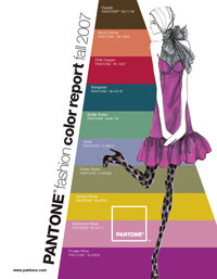
Looking for inspiration? Take your cue from the fashion runway. You can stay up-to-date on the season’s color palette by visiting Pantone’s website (http://www.pantone.com) for their fashion color report. A few of this Fall’s delicious colors include chili pepper, lemon curry, and purple wine.

Of course you can’t just follow color trends blindly. The most important thing is that your site’s colors harmonize with your images. You don’t want a background that dominates over your images. Colors also help set the tone of your website. For an organic feel, try soft and muted earthtones. Bright, vivid colors can accentuate an edgier, rock-and-roll feel. Whatever your mood, your colors are a highly personal decision and reflect your style and personality.
And for a fun little tool that illuminates the full spectrum of photographic color, check out Jim Bumgardner’s Flickr Experimental Colr Pickr (found via Lifehacker).
(edit) One other important deciding factor for selecting your colors is to ensure your font color is clearly legible against your background color. There are even algorithms out there that help test your color contrast, as illustrated by this simple tool, called the Colour Contrast Check Tool. You can find similar resources on color contrast tools here.

