If your business’s Facebook page is looking more dead than alive, here are 5 simple things you can do to add a little life to your Page and hopefully gain more followers.
1. Post!
So this one can seem the most daunting, but really it is the most natural and critical step you need to make to gain traction for your page. Your number one priority is to identify who your audience is and why you decided to create a Facebook Page in the first place. Do you specialize in Senior Portraits? Naturally your audience is going to be younger – choose topics teenagers might find interesting.
Here are a few do’s and don’ts about posting:
- Don’t post too often – sure, you don’t want tumbleweeds blowing through your page, but you also don’t want to turn off your audience by posting every hour – keep it down to 3 posts a day, maximum.
- Do show your personality – let your natural voice shine through so people know what they can expect from your business.
- Do add links and photos to your posts – adding one or both makes it more likely for users to engage with your posts and an opportunity to “Like” your images.
- Don’t forget to ask users to “Like” your images – a simple question such as, “Are you hiring a DJ or a live band for your wedding?” is a great way to engage a bride, if you specialize in wedding photography.
2. Schedule Your Posts
There’s no reason you have to be a slave to posting – instead you can quickly hash out a bunch of post ideas and schedule your page posts in advance. You can either use a social media software tool (like Hootsuite) or just use Facebook’s built in post scheduler. You can set aside some time each week to write all your posts for the week, then just pick the date and time you wish them to post. You may even want to do a little testing to see what time of day or days of the week are your audience’s peak engagement times and schedule your posts to run then.
3. Upload and Create Photo Albums
Don’t limit your images to just client images – make photo albums to show off your photography studio, you and your assistants or staff, and even highlight your Photoshop skills with before-and-after retouching shots. Red Leaf Studios does an excellent job of showing before-and-after images using their popular Photoshop actions. Show people the man or woman behind the lens and emphasize your creative side. Add captions with brief descriptions to give your clients a little more insight into how you work.
4. Fill in Your Basic Stats
Even the most rudimentary Facebook Page needs to include vital bits of information about your business – adding your address is imperative for clients searching for your services. If you add in your studio’s address, you also allow your clients to check in on Facebook when they arrive at your studio for a photo session or appointment. And of course you will want your clickbooq website URL prominently displayed on your About page so people can check out your online portfolio.
5. Enhance your Facebook Page Visually
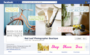
Just like all your marketing and branding materials, you want to have a consistent look and feel across all your Pages and Social Media profiles. The largest branding space on your Page will be your Cover Photo – a single image within a 851 x 315 pixel area. Find a unique image that you feel best represents your business – whether it is a photo of your studio or one of your client images. Just don’t break any of the Facebook rules for your Cover Photo:
- No ads, promos, or coupons.
- No pricing or purchase information.
- No contact information – save this for your About section.
- Don’t add “Like” or “Share” elements into the image itself.
- No call to action, like “Spread the word”.
Your profile picture is a smaller 240 x 540 image which will also be your thumbnail icon and main brand image for mobile devices. This should be an easily identifiable logo-type image and will appear next to all of your posts – California Academy of Sciences uses a cute little penguin.
Browse other Facebook Pages for businesses you like to get ideas for creating a visually appealing Page for your business.


